
In a first article dedicated to primary colours in decoration, we explored the impact of blue, red and yellow on our interiors, as well as their influence on our emotions and our perception of space.
→ Read here: The meaning of primary colours in decoration
This second part focuses on three essential shades: orange, terracotta and green.
Less frank but deeper, these colours allow you to structure an interior, to bring warmth and to create a more natural and enveloping atmosphere.
Why do colours influence our interiors so much?
Colours have a direct impact on our perception of a space, but also on our state of mind.
Some shades boost energy, others promote calmness. Some visually enlarge a room, while others make it more intimate.
Natural colours such as green or terracotta are particularly used to create balanced and reassuring environments. Conversely, warmer colours such as orange can energise a space and make it more lively.
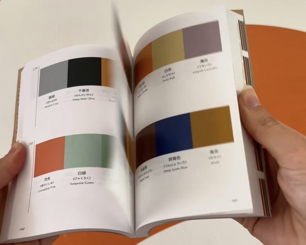
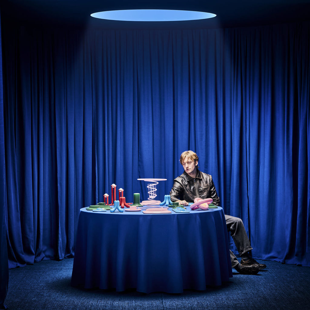
In interior design, the choice of colours is therefore strategic: it influences the atmosphere, the luminosity and the perception of volumes.
What is the meaning of colors in decoration?
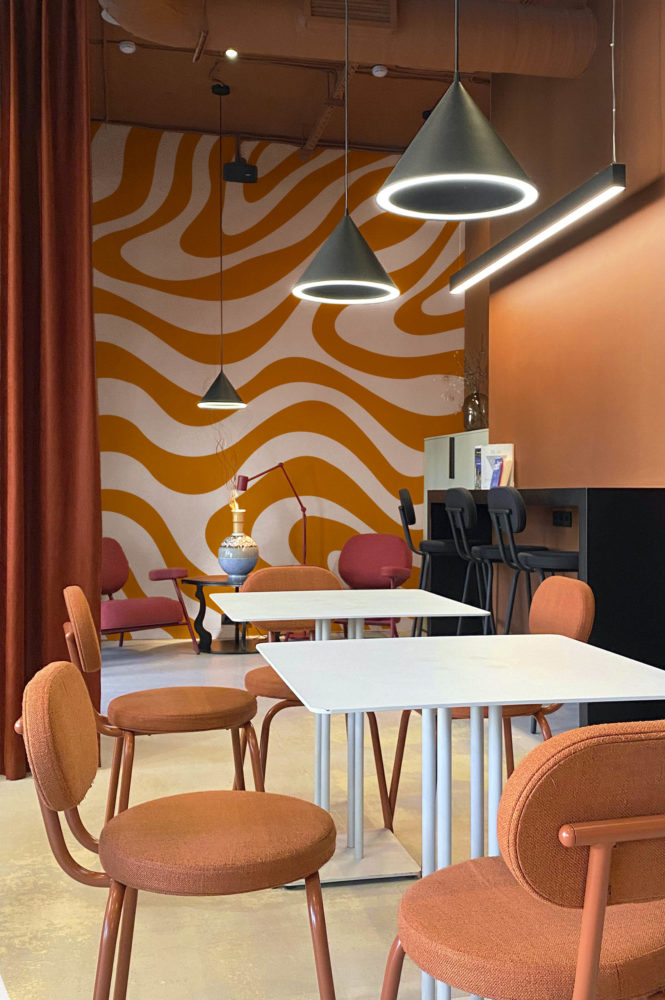
Orange: a warm and stimulating colour
Orange is a color associated with warmth, friendliness, and creativity.
Widely used in interior decoration, it makes a room immediately more welcoming. Unlike red, it remains softer and easier to integrate into large areas.
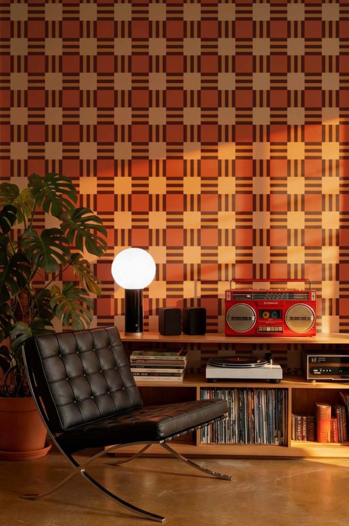
Shades such as burnt orange are now very present in decoration trends, especially for their ability to create an atmosphere that is both modern and warm.
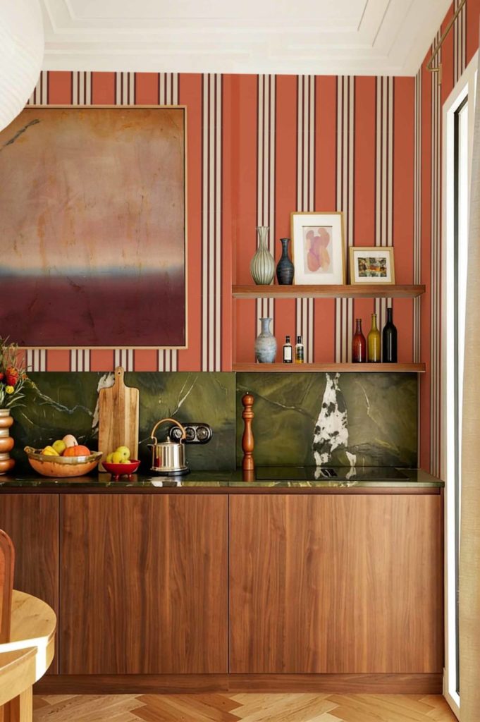
How to use it?
An orange wallpaper, with subtle patterns, allows you to structure a wall without weighing down the space. Ideal in a living room, dining room or living space.
Terracotta: a natural and reassuring colour
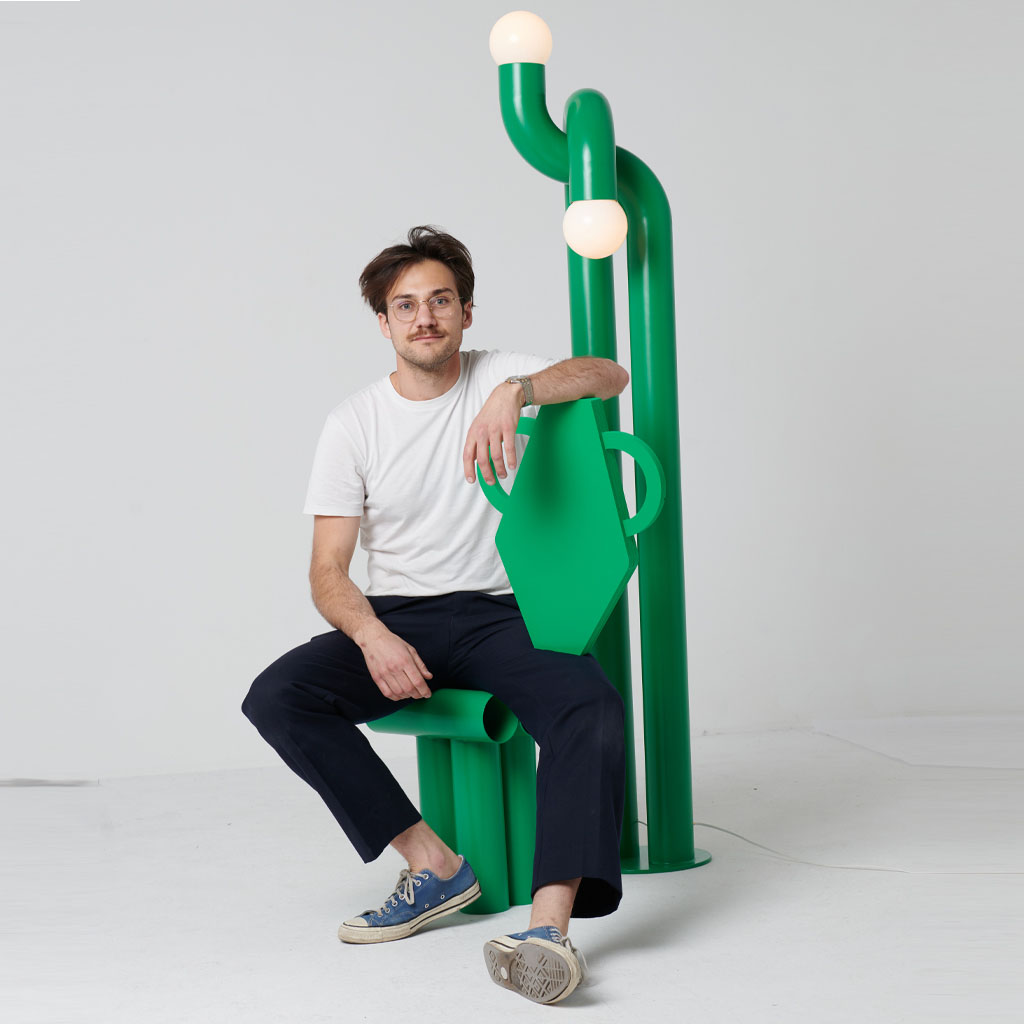
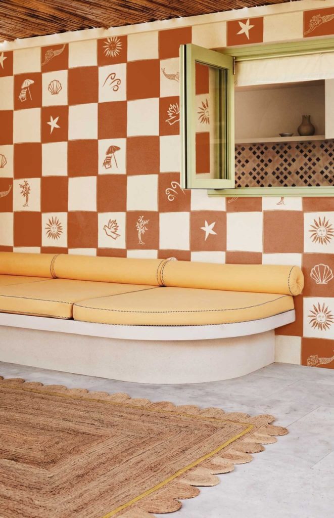
Terracotta is a color directly related to nature, stability and comfort.
It evokes raw materials such as wood or earth, making it an ideal shade to create an authentic and timeless atmosphere.
Very present in contemporary interiors, it fits perfectly into minimalist, bohemian or natural styles.
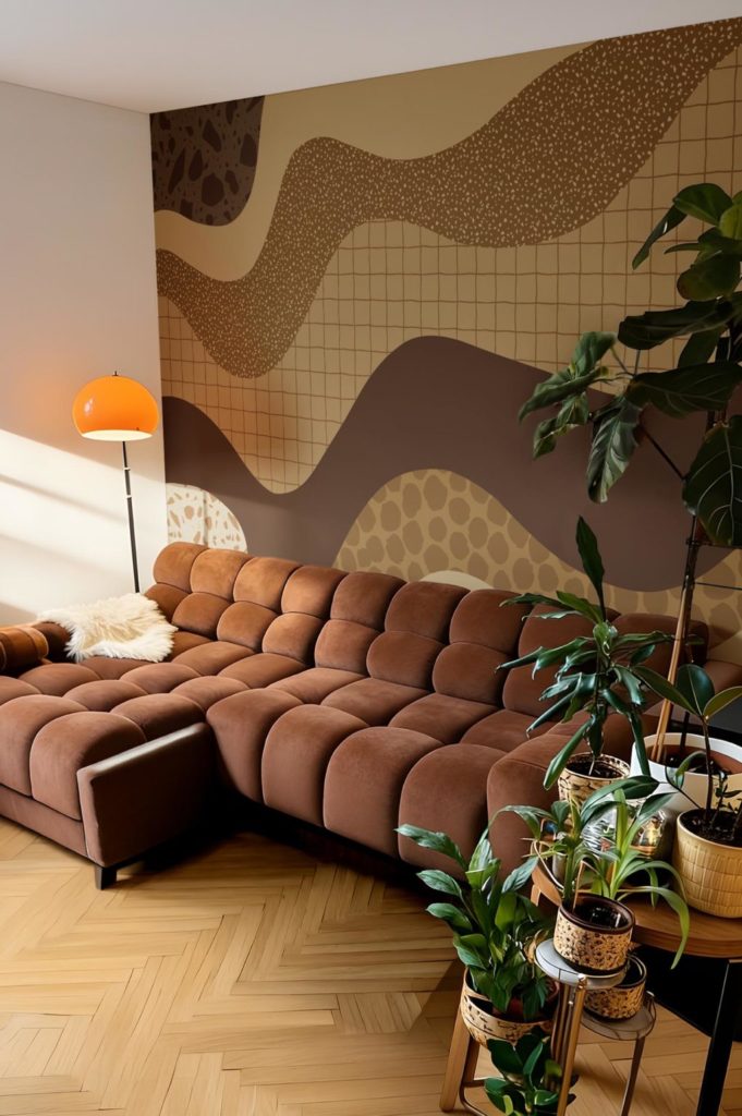
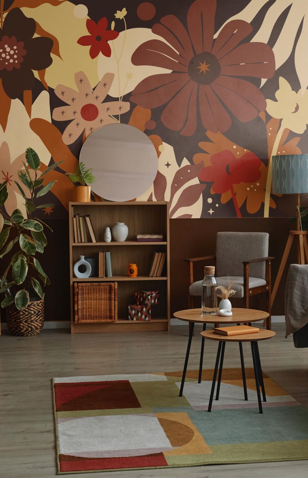
How to use it?
A gradient wallpaper can bring depth to a room. Combined with light tones such as beige or off-white, it balances the whole and avoids darkening the space.
Green: a soothing and balanced colour
Green is one of the most used colors in interior design for its ability to create a calming atmosphere.
Combined with nature, it brings a feeling of freshness and balance. It is particularly recommended in areas dedicated to rest or concentration.
Shades like sage green or sea green are great for a soft vibe, while emerald green helps add a more elegant and sophisticated touch.
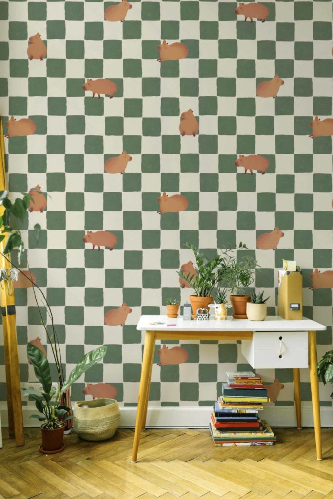
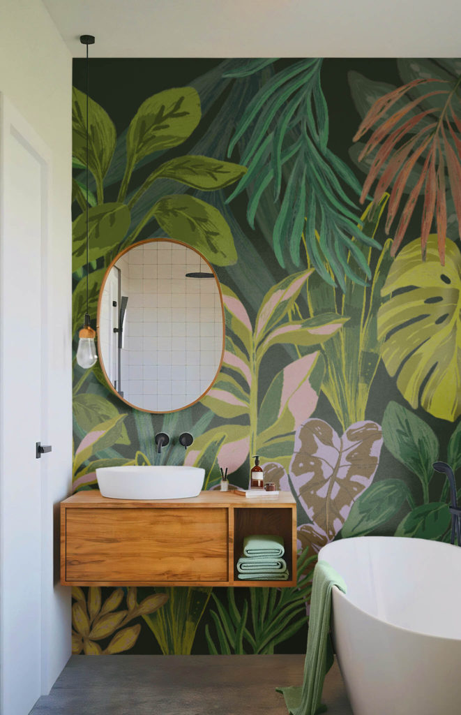
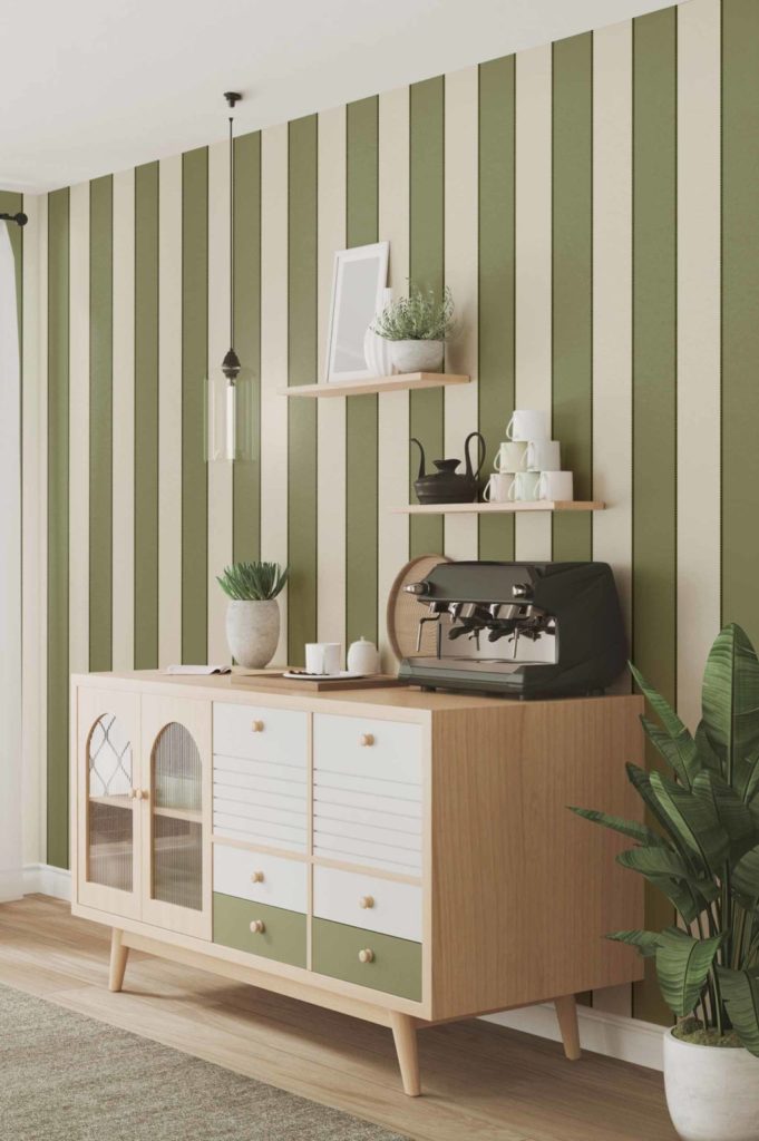
How to use it?
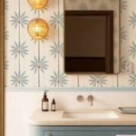
A plant wallpaper or patterns inspired by nature allow you to create an immersive and coherent universe, without multiplying decorative elements.
Which colors to choose according to the rooms?
To use these shades properly, it is important to adapt them to each space:
• Living room : favor warm tones such as orange or terracotta to create a friendly atmosphere
• Bedroom : opt for shades of green to promote calm and rest
• Small spaces: integrate these colours in touches or patterns to maintain lightness
• Living spaces : mix these colors with neutral bases for visual balance
Integrate colors easily with wallpaper and stickers
Colors play a key role in interior design. They influence the atmosphere, the perception of space and the feeling of everyday life.
Wallpaper and wall stickers make it easy to test these colors, without having to do any major work. They offer an ideal solution for customizing an interior, creating a focal point or transforming a room in depth.
Related Posts