Finding colors that truly work together is often trickier than it seems.
Between combinations that feel too bland and those that clash, we often end up spending hours scrolling through Pinterest in search of the perfect match…
What if we told you that there is a miracle book, more than 100 years old, that does all the work for you?
In this article, we reveal everything about this cult book and the most beautiful palettes we have drawn from it.
What is “A dictionary of color combinations?”
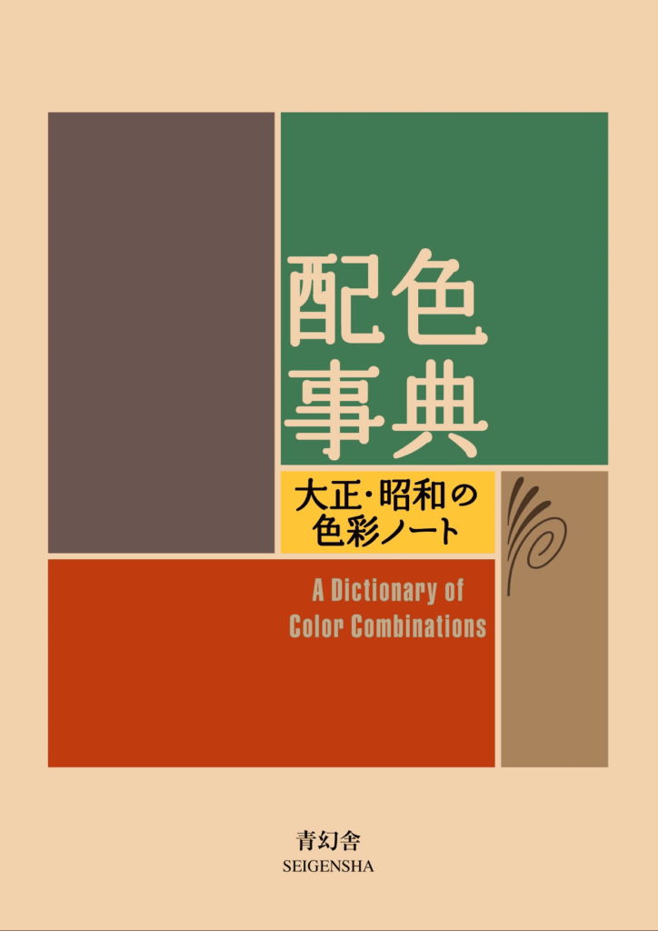
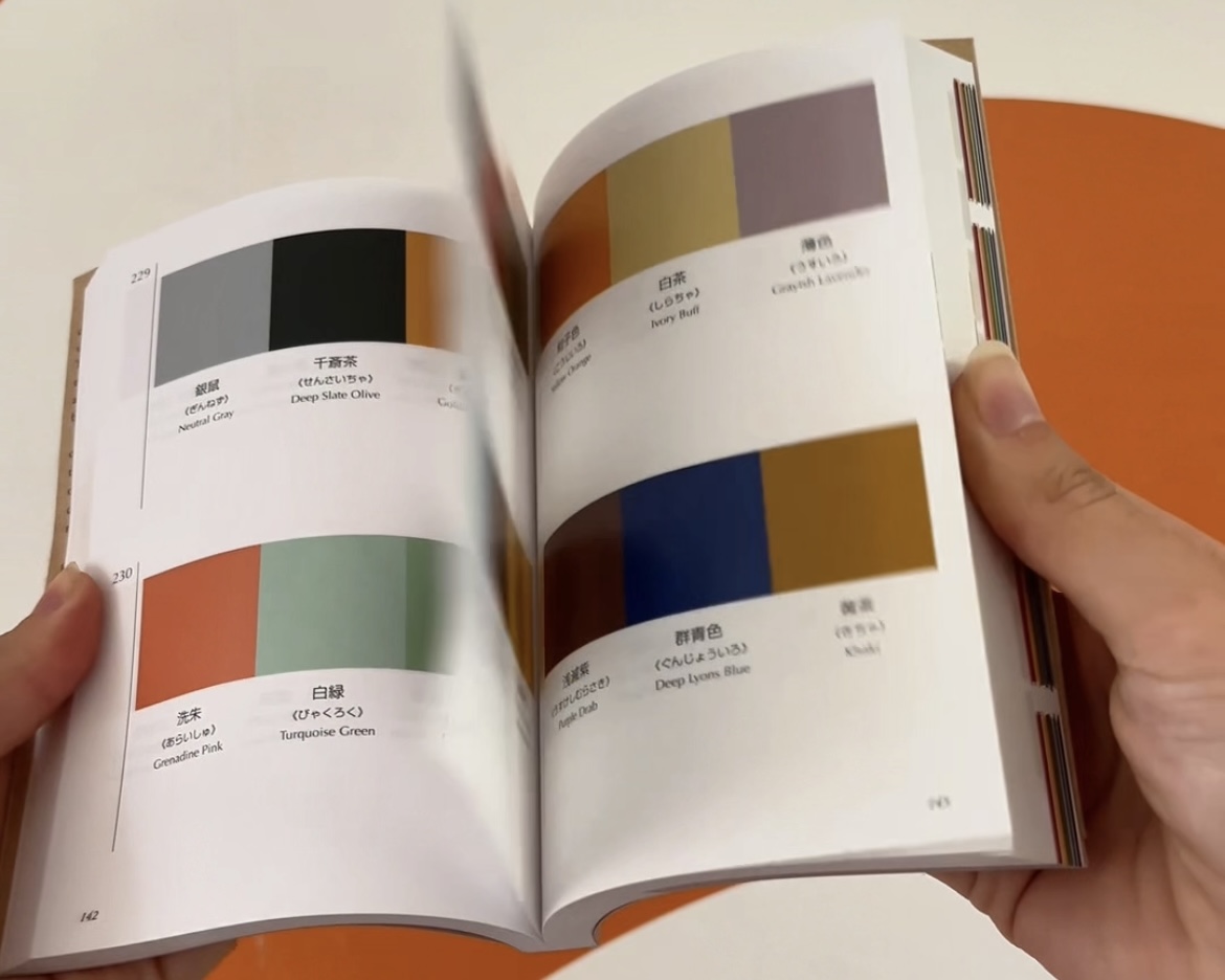
First published in the 1930s, A dictionary of color combinations was created by Sanzo Wada, a Japanese designer and teacher.
His idea? Bringing together in a single work hundreds of color combinations that work every time: some soft and natural, others bold, but always harmonious and timeless.
Each page is a little gem of inspiration. Whether you’re a creative soul, an aspiring decorator, a stylist, or simply a color enthusiast, this book has the power to guide you!
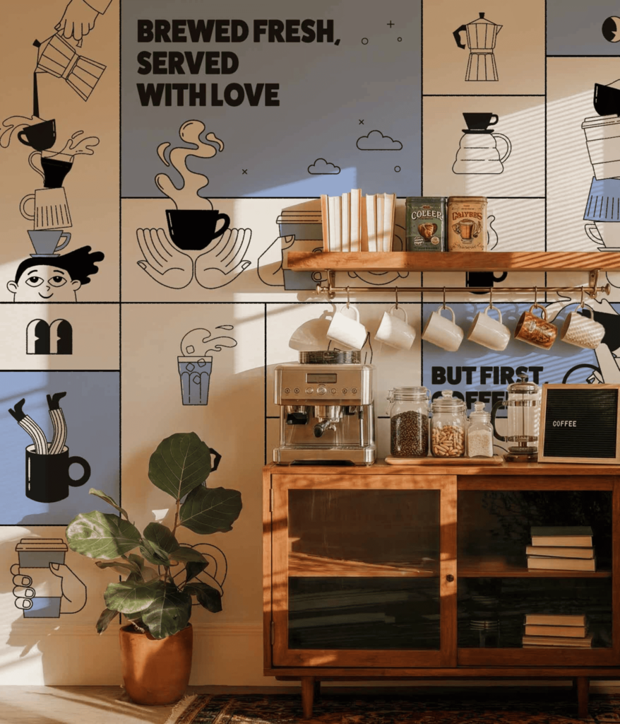
It continues to inspire our graphic designers, who use it to imagine the designs of our wallpapers. 🎨
Our 5 favorite combinations
Now that you know a little more about this cult book and its incredible power of inspiration, it’s time to put it into practice.
We present our 5 favorite palettes, and how our graphic designers have transformed them into wallpapers and inspiring decorative atmospheres
Ready to discover our favorites? Here we go!
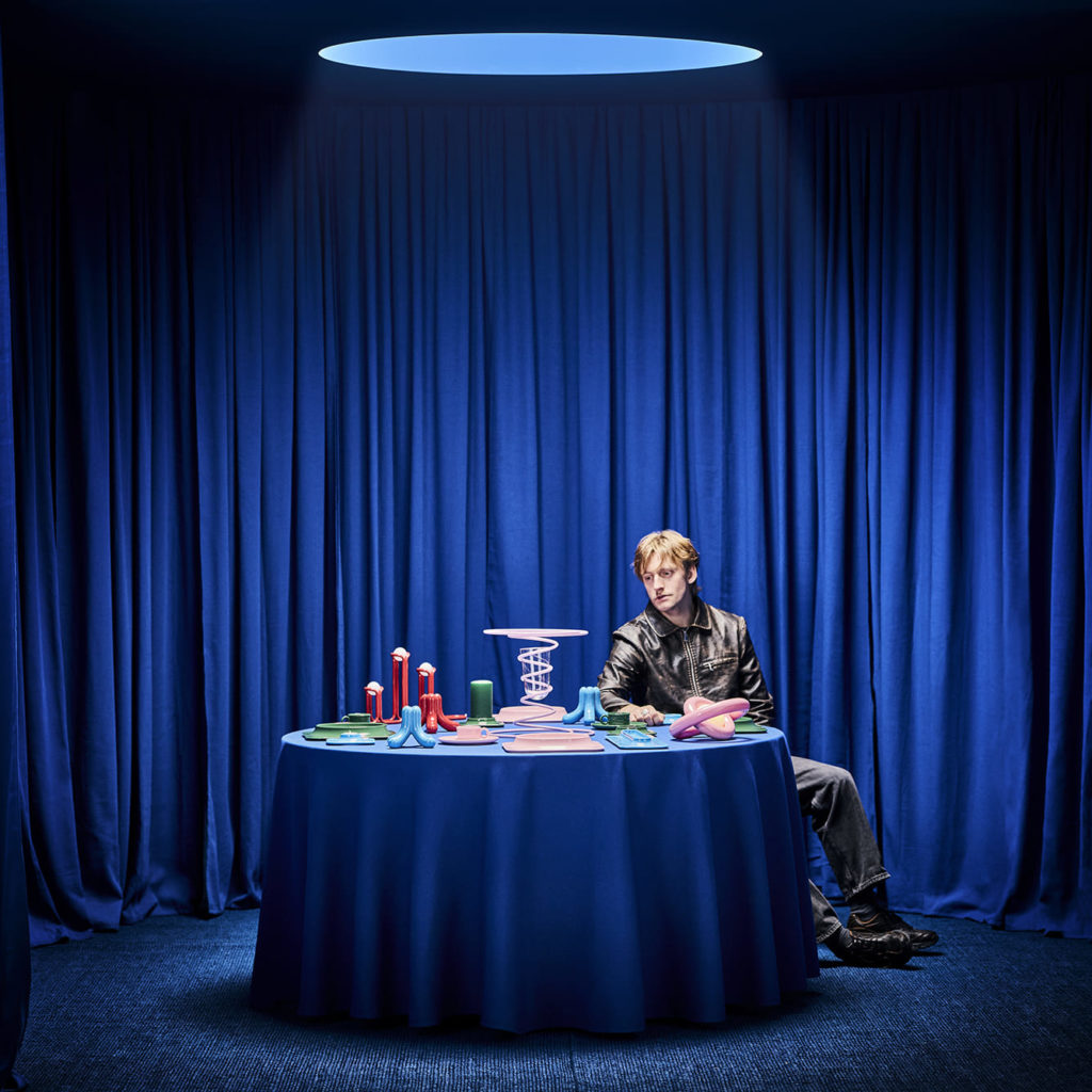
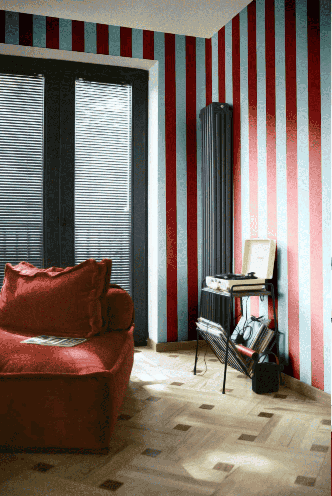
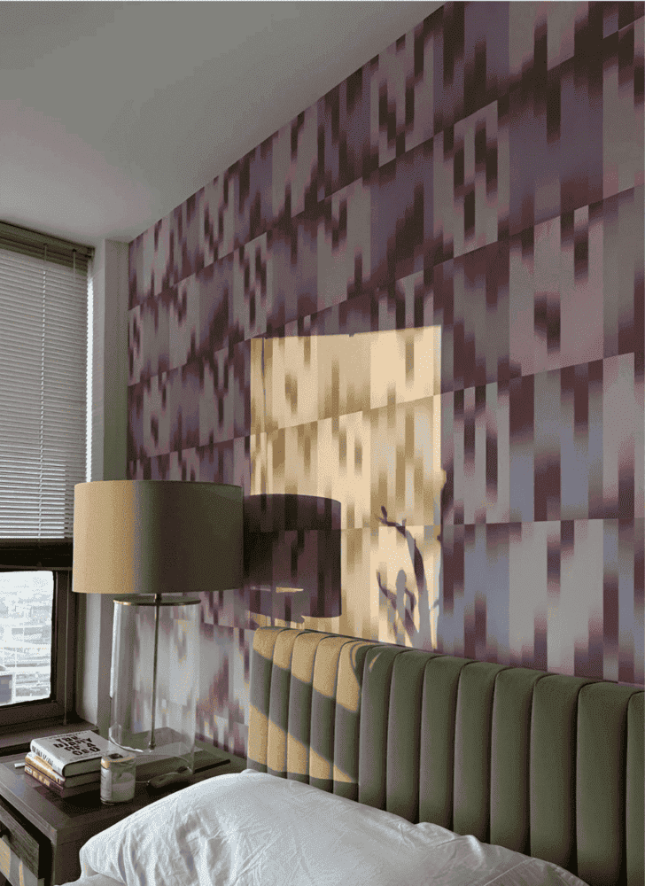
1. Color Combo 237: THE big trend of this fall
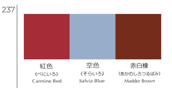
It creates an atmosphere that is both warm and hyper elegant. The blue perfectly softens the brown and dark red, in short, we love it!
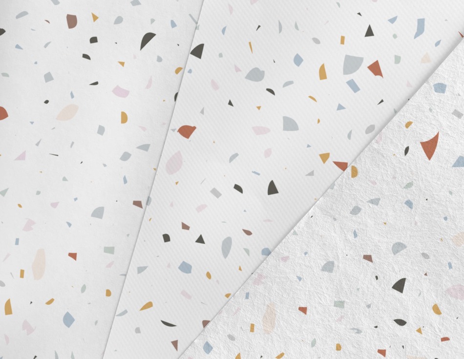
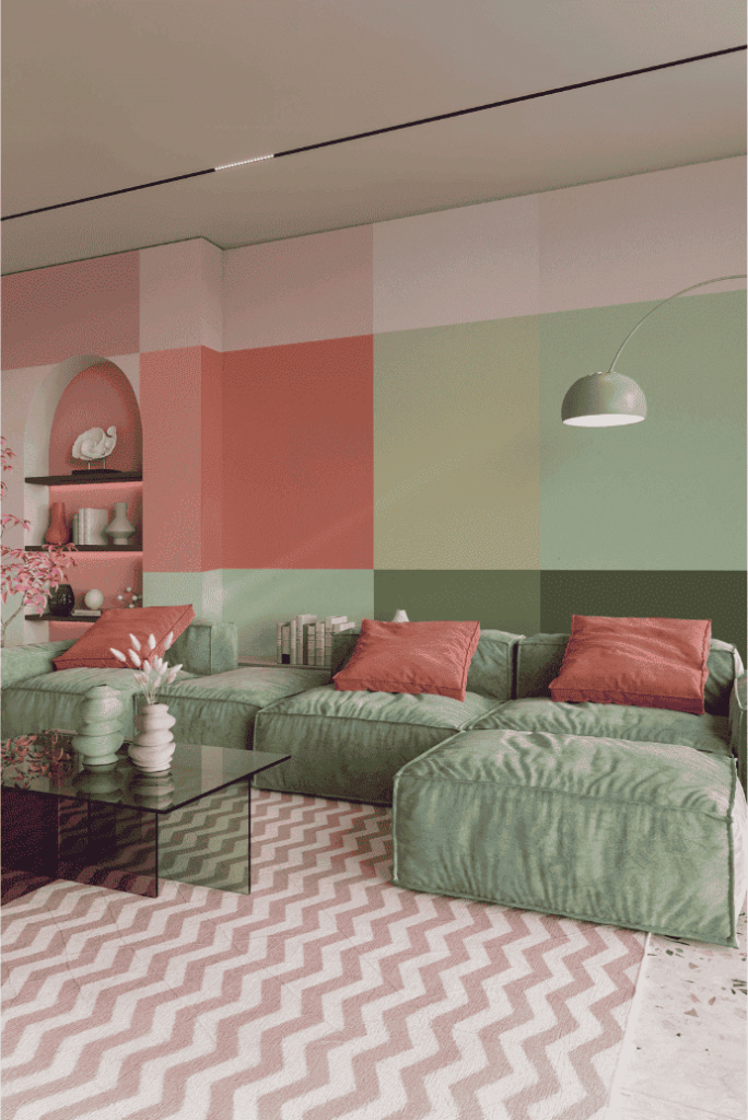
2. Color Combo 230: Vintage and Freshness
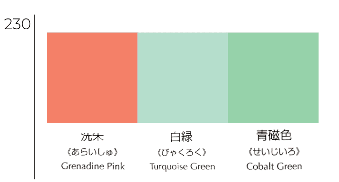
The pink, green and turquoise trio brings a burst of energy to any room.
A bold but balanced combo, perfect for bringing a retro and joyful touch.
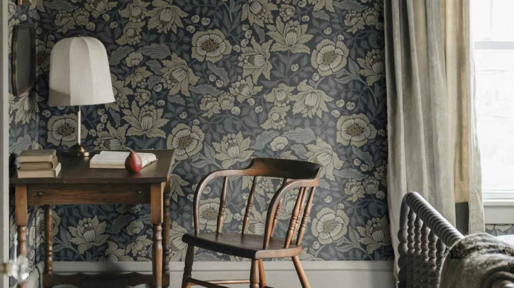
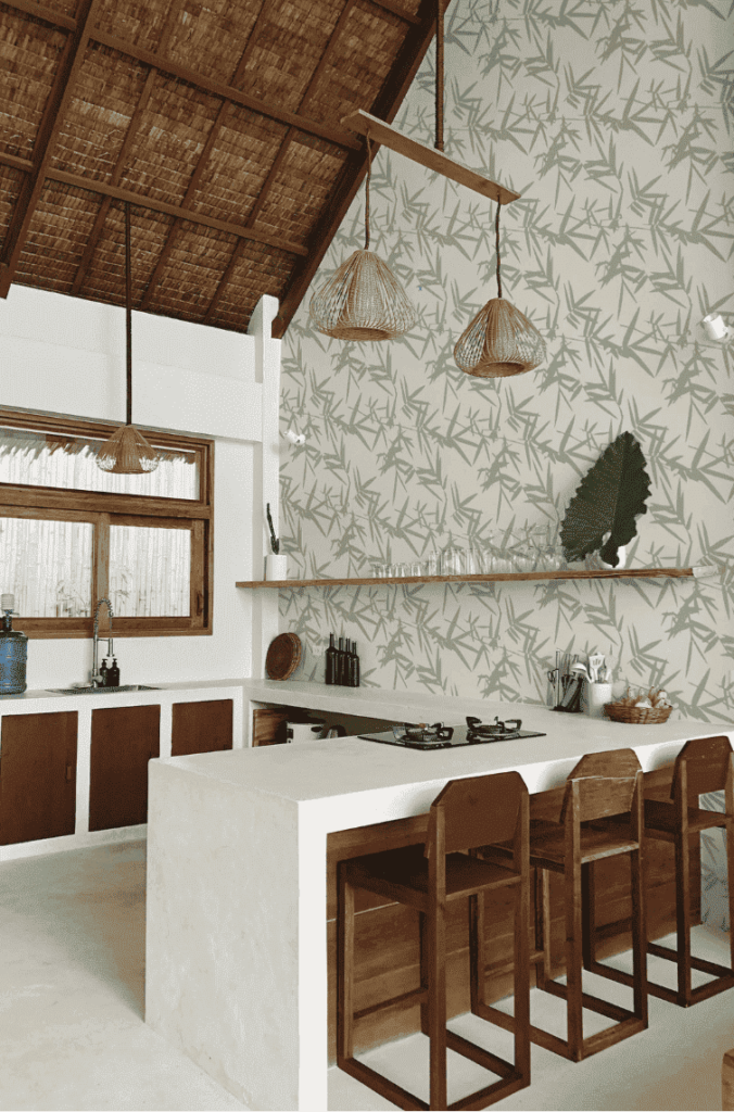
3. Color Combo 121: Nature and Authenticity
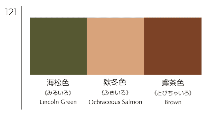
Earthy and vegetal shades that evoke wood, earth and nature, for an authentic result.
Depending on the colour chosen as an accent, this combo gives off a very soft or more pronounced atmosphere.
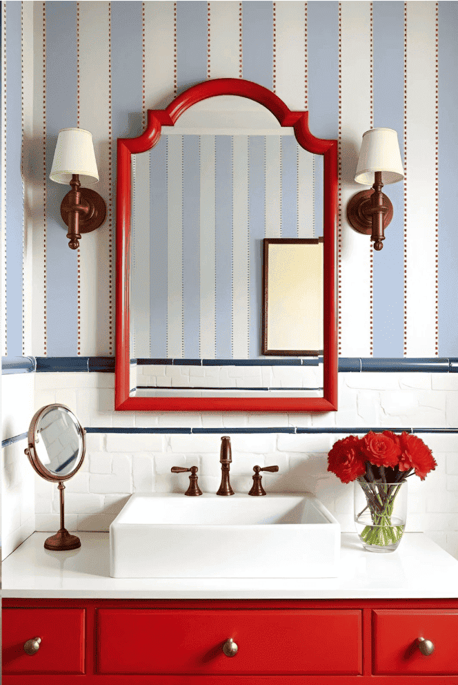
4. Color Combo 154: The Boldness of Primary Colors
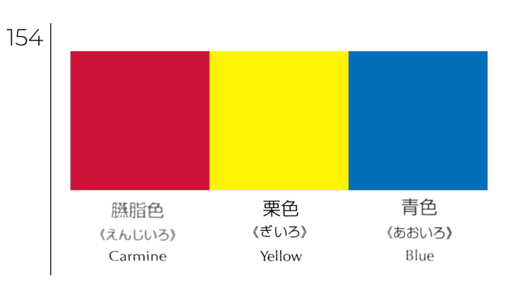
A palette of primary colors for a bold and energetic look!
This personality-packed combo catches the eye and brings a real burst of energy to any room.
5. The 177 Combination : Retro Sweetness
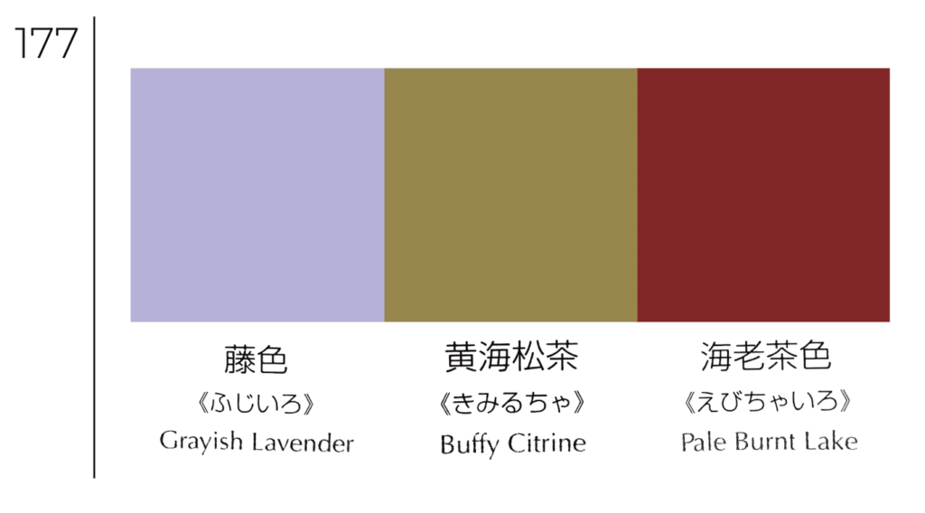
Powdery and slightly vintage tones that are reminiscent of the interiors of the 60s, while remaining very current.
The subtle blend of pale yellow, muted lavender, and smoky blue creates a bright, soothing atmosphere with a touch of gentle nostalgia.
What if your wallpaper took on exactly the hues of your favorite combo?
Our graphic designers can customize the colors to create the perfect match for you.
Just tell us: we’ll take care of the rest 💕
Related Posts